今回は、レスポンシブなコンテンツを作成していきます。
基本的なセットアップは終わっていることを前提していますので、それらについては下記を参照してください。
 Angularに必要なツールのインストール
 Angular Materialを使ったプロジェクトの作成
 Angular Material + Flex Layout その1 フッターを下部に固定する
 Angular Material + Flex Layout その2 ツールバーの配置
各種バージョンは以下のとおりです。
- Angular CLI: 11.2.8
- Node: 15.10.0
- Angular Material: 11.2.8
TOC
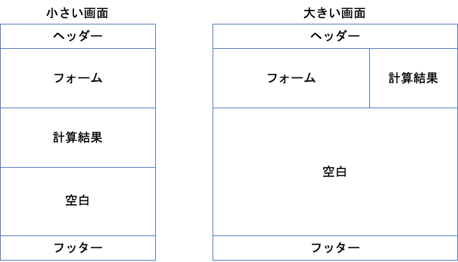
今回の目標とソースコードについて
今回できあがるページのイメージとソースコードは以下のとおりです。
メインのコンポーネント作成
メインにあたるコンポーネントを作成します。念の為、どのファイルに変更が加わるか--dry-runで確認してから作成します。
$ ng generate component main -m app --dry-run
CREATE src/app/main/main.component.scss (0 bytes)
CREATE src/app/main/main.component.html (19 bytes)
CREATE src/app/main/main.component.spec.ts (612 bytes)
CREATE src/app/main/main.component.ts (268 bytes)
UPDATE src/app/app.module.ts (834 bytes)

NOTE: The "dryRun" flag means no changes were made.

$ ng generate component main -m app
CREATE src/app/main/main.component.scss (0 bytes)
CREATE src/app/main/main.component.html (19 bytes)
CREATE src/app/main/main.component.spec.ts (612 bytes)
CREATE src/app/main/main.component.ts (268 bytes)
UPDATE src/app/app.module.ts (834 bytes)続いて、メインコンポーネントを表示するためにapp.component.htmlを編集します。
<div class="wrapper">
  <app-header></app-header>
  <div class="main">
    <app-main></app-main>
  </div>
  <app-footer></app-footer>
</div>
この時点で下記のように表示されていればOKです。
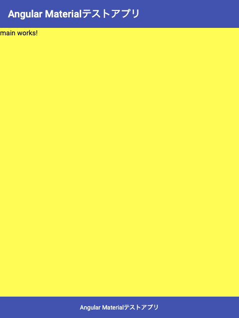
Angular Materialコンポーネントをメインに追加
メインコンポーネントという箱ができたので、ここにAngular Materialのコンポーネントを入れていきます。
今回は、Inputを使ってフォームを作成。その入力された内容を元に、大きい画面では横に、小さい画面では下に結果を表示する Webページを作ります。
Flex Layoutに移る前にフォームとその結果を出す部分を作成します。フォームに日本円の値を入れると1ドル105円で計算したとき、何ドルになるか表示する簡単なものを想定します。変更内容は以下のとおりです。
import { NgModule } from '@angular/core';
import { BrowserModule } from '@angular/platform-browser';
import { FlexLayoutModule } from '@angular/flex-layout';

import { AppComponent } from './app.component';
import { BrowserAnimationsModule } from '@angular/platform-browser/animations';
import { MaterialModule } from './shared/material.module';
import { FooterComponent } from './shared/footer/footer.component';
import { HeaderComponent } from './shared/header/header.component';
import { MainComponent } from './main/main.component';
import { FormsModule } from '@angular/forms';

@NgModule({
  declarations: [
    AppComponent,
    FooterComponent,
    HeaderComponent,
    MainComponent,
  ],
  imports: [
    BrowserModule,
    BrowserAnimationsModule,
    FlexLayoutModule,
    MaterialModule,
    FormsModule
  ],
  providers: [],
  bootstrap: [AppComponent]
})
export class AppModule { }ngModelを使用したいので、app.module.tsに追加しました。
<div class="main-container">
<div class="form-container">
<mat-form-field appearance="fill">
<mat-label>日本円を入れてください。</mat-label>
<input matInput type="number" [(ngModel)]="yen">
</mat-form-field>
</div>
<div class="result-container">
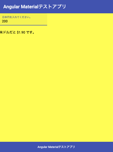
米ドルだと {{ dollar() | currency }} です。
</div>
</div>
Angular Materialの例から前回と同様にコピペしてきました。入力された値をyenに双方向バインディングして、結果はdollar() | currencyで表示させています。これらの値と関数は下記のように実装しています。
import { Component, OnInit } from '@angular/core';

@Component({
  selector: 'app-main',
  templateUrl: './main.component.html',
  styleUrls: ['./main.component.scss'],
})
export class MainComponent implements OnInit {
  yen = 0;

  constructor() {}

  ngOnInit(): void {
  }
  dollar(): number {
    return this.yen / 105;
  }
}
ここまでで、画面は以下のようになっていると思います。
レスポンシブなレイアウト
続いて、レスポンシブなレイアウトに変更していきます。ここで使うのがFlex Layoutです。やりたいことは以下のとおりです。
- 大きな画面では、フォームと結果を横に並ぶ
- 小さな画面では、フォームと結果が縦に並ぶ
- 配置がわかりやすいように背景色などつける
まずは、flexレイアウトをHTMLに適用します。
<div class="main-container" fxLayout="row" fxLayout.lt-sm="column" fxFlex >
  <div class="form-container" fxFlex="60" fxFlex.lt-sm="100px">
    <mat-form-field appearance="fill">
      <mat-label>日本円を入れてください。</mat-label>
      <input matInput type="number" [(ngModel)]="yen">
    </mat-form-field>
  </div>
  <div class="result-container" fxFlex="40" fxFlex.lt-sm="100px">
    米ドルだと {{ dollar() | currency }} です。
  </div>
</div>
上記のHTMLで2つの設定を適用しています。
- ウィンドウサイズが
lt-sm(幅599px以下)の場合にはfxLayoutをcolumnにする。その場合、各配下のアイテムは高さ100pxで表示 - ウィンドウサイズが600px以上の場合には、
fxLayoutをrowにする。その場合、各配下のアイテムは60:40の割合で表示する。
これによって、大きいスクリーンでは、6:4でフォームと結果が表示されます。また、小さい画面だとそれらが縦に並びます。(高さは指定していますが、指定する必要はありません。)
続いて、設定した値が画面上わかりやすいようにCSSを少し変更します。
.form-container {
background-color: white;
height: 100px;
}
.result-container {
background-color: skyblue;
height: 100px;
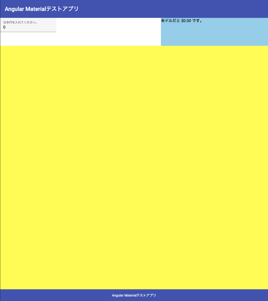
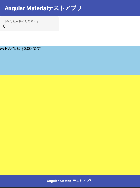
}これによって、大きな画面ではフォームと結果が色分けされた上で、高さ100pxで表示されるようになったはずです。画面のスクリーンキャプチャは以下のとおりです。
大きい画面
小さい画面
まとめ
今回は、メインのコンテンツをFlexLayoutで簡単に作成しました。次回はもう少しメインにコンポーネントを増やして、いろいろなFlexLayoutを試していきたいと思います。
 Angular Material + Flex Layout その4 ネステッドなFlex Layout